Maxion Therapeutics is a biotech startup using their revolutionary KnotBody® technology to tackle previously undruggable ion channel and GPCR-driven diseases.
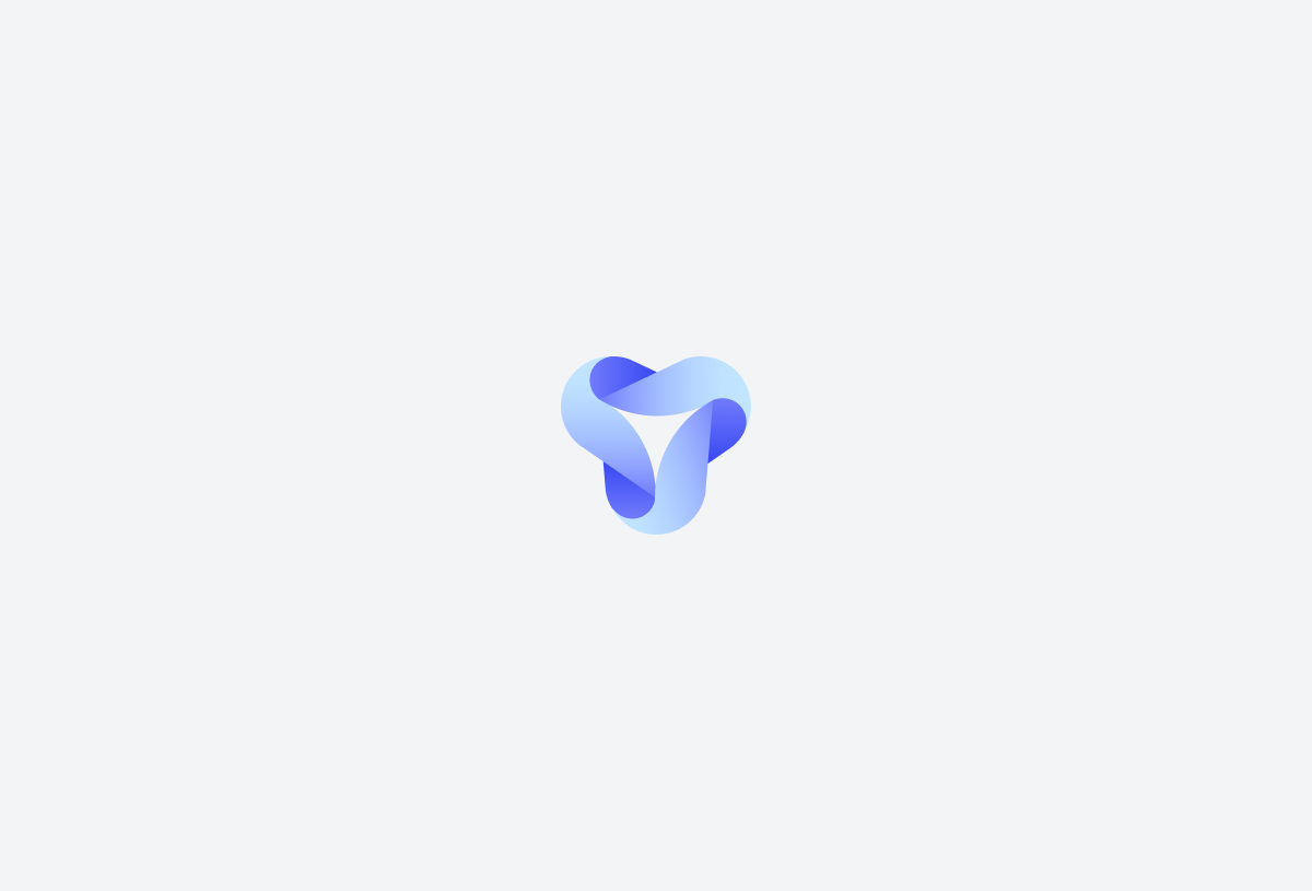
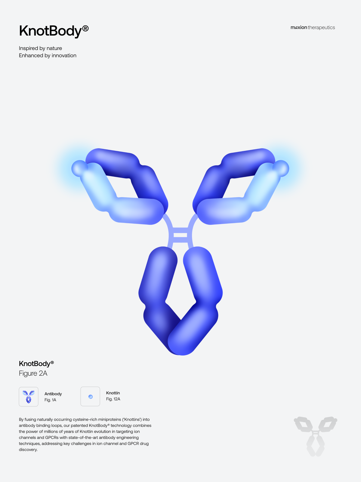
Maxion Therapeutics was founded in 2020 by John McCafferty, PhD and Aneesh Karatt Vellatt, PhD. We worked together with the founders to craft a brand that embraced their challenge: discovering transformational therapies for untreatable diseases caused by ion channels and GPCRs. Developing brands for new ventures faces an immediate challenge: putting a face to the unknown. Knotbodies are the result of fusing Knottins (cystein-rich mini-proteins) into antibody binding loops. Knottins contain two disulfide bonds forming a loop through which a third disulfide bond (linking the 3rd and 6th cysteine in the sequence) passes, thus creating a knot-like shape. We created a brand symbol that roots from the scientific challenge Maxion is tackling: ion channels as the targets, and the fusion of antibodies and knotting as the therapeutic route.
We crafted a logotype identity that would stand out in the multiple formats the company might require, a brand that is meaningful in small and large formats, dark and light backgrounds. We analysed the colour code associated with the major players in the ion channel-related diseases. In the end, we created a unique Maxion gradient Pantone. Originating in the range of Purple, we extracted Maxion® Ultraviolet and Maxion® Purple.
Illustration Kit
We created a set of 40 illustrations to help illustrating Maxion Therapeutics' mission. The illustrations were created using the brand identity. In addition, a silhouette version was crafted to allow the team to create simpler diagrams. The illustrations can be used individually or in groups to explain processes and molecular pathways using a simple drag-and-drop system.